
Enhancing Your Course with Advanced Content
Beyond the core components, Blend-ed supports a wider set of content types called advanced components — interactive content, embedded documents, SCORM packages, external tools, and more.
Advanced components differ from core components in one important way: they aren’t available until you enable them for your course. This article covers how to enable them, how to add them, and what each one does.
Part 1: Enable advanced components for your course
Section titled “Part 1: Enable advanced components for your course”By default, the Advanced option in the Add a Component window offers nothing. You first enable the modules you want.
-
In the course-level left navigation, scroll to OTHER SETTINGS and click Advanced Settings.
-
Scroll to Advanced Module List.
-
Under Suggested modules, click the + on any module you want to enable. It moves up into Enabled modules.
-
Click Save Changes.
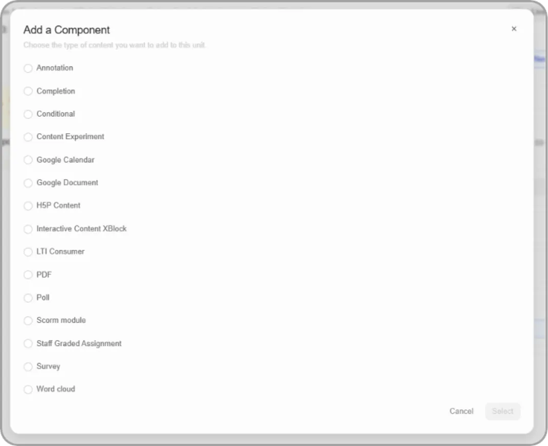
Suggested modules
| Module key | Component |
|---|---|
| h5pxblock | H5P XBlock |
| edx_sga | Staff Graded Assignment |
| conditional | Conditional Block |
| scorm | SCORM Module |
| poll | Poll Block |
| survey | Survey Block |
| annotatable | Annotation Block |
| done | Completion Block |
| lti_consumer | LTI Consumer |
| PDF XBlock | |
| google-document | Embed Google Slides |
| interactive_content_xblock | Interactive Content |
Hover any chip to see its full name.
Enabling a module that isn’t suggested
Type the module key into the Add module field and click + Add Module. Use this for anything not in the suggested list, such as Content Experiment, Google Calendar, or Word cloud.
Tip: Enable only what you’ll actually use. A shorter list keeps the Add a Component window easier for your team to scan.
Warning: Removing a module from Enabled modules while components of that type still exist will break those components. Delete the components first.
Other settings on this page
The Advanced Settings page also holds Course Dates, Learner Features (Calculator, Student notes, subsection prerequisites), Additional Features (proctored exams, social sharing), and Course Customization (custom CSS and JavaScript URLs, LTI passports, other course settings). These are covered in Advanced Course Configuration.
Part 2: Add an advanced component
Section titled “Part 2: Add an advanced component”-
Open the Unit you want to add content to.
-
Click + Add component.
-
Choose Advanced, then click Add component.
-
Select a component from the list and click Select.
-
Configure it and save.
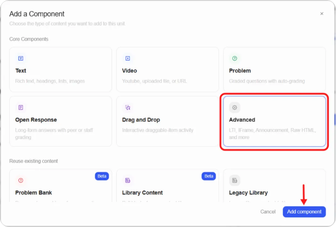
Note: Advanced components open a settings-style editor with named fields rather than the visual editor used by Text and Problem. Most also have a settings panel for display name, grading, and component-specific options.
Part 3: Advanced components
Section titled “Part 3: Advanced components”Annotation
Section titled “Annotation”What it’s for. Guided close reading. You mark up a passage with commentary that learners reveal by clicking a highlighted phrase, and you can tie each annotation to a problem on the same page. Good for analysing a source document, walking through a standard or contract clause by clause, or teaching a text where interpretation matters as much as content.
Setting it up. The EDITOR tab holds XML, not a visual editor. The component arrives pre-filled with a working example you replace.
-
Add the component and click the pencil icon.
-
On the EDITOR tab, replace the text inside <instructions> with your own guidance, written in HTML.
-
Replace the sample passage with your text.
-
Wrap each phrase you want annotated in an <annotation> tag.
-
Click Save.
The structure is an <annotatable> root containing an optional <instructions> block and your passage.
| Attribute | Required | What it does |
|---|---|---|
| body | Yes | The text of the annotation |
| title | No | Annotation title. Defaults to Commentary |
| problem | No | Zero-based index of the problem this annotation relates to, so problem=“0” is the first problem on the page |
| highlight | No | yellow, red, orange, green, blue, or purple. Defaults to yellow |
Learners see the passage with your highlights and a control to show or hide the annotations.
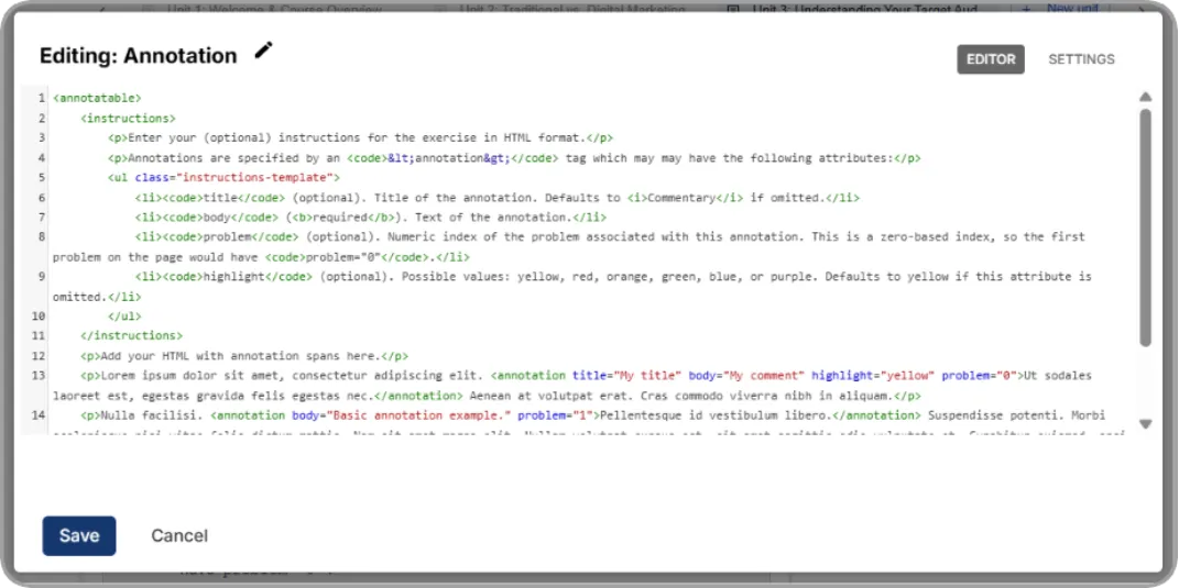
Completion
Section titled “Completion”What it’s for. A single control learners click to confirm they’ve finished something. Use it for work that happens away from the platform: reading a printed handbook, attending a session, completing a task at their workstation. It’s the only way to get completion data on activity the platform can’t otherwise observe.
Important: this component is graded. It always appears on the learner’s Progress page. Where it sits determines what that means:
-
In an ungraded subsection — the score appears as a practice score and doesn’t affect the final grade.
-
In a graded subsection — it counts toward the final grade. Learners who mark the activity complete score 1/1; learners who don’t score 0/1.
Use it in ungraded subsections unless you specifically intend completion to carry marks.
Setting it up.
-
Add the component from the Advanced list.
-
Click the pencil icon and set the Display Name.
-
Click Save.
There’s no content to author. The component renders a Mark as complete control; once a learner clicks it, the label becomes Unmark, so they can change their mind as often as they like.
Conditional
Section titled “Conditional”What it’s for. Hides content until a learner has done something else first: attempted a problem, answered a poll, submitted work. Good for releasing an answer key only after submission, gating bonus material behind an assessment, or enforcing a sequence within a single unit.
Setting it up.
-
Add the component from the Advanced list. It’s added to the unit immediately.
-
First, get the ID of your source component. Open the component the condition depends on, open its settings, and copy its component location ID.
-
Return to the Conditional component and click the pencil icon.
-
Configure the fields below.
-
Click Save, publish the unit, and check it with View Live Version.
| Field | What to enter |
|---|---|
| Source Components | The component location IDs of every component the condition checks |
| Conditional Attribute | Which attribute must match: poll answer, submitted, attempted, correct, or voted |
| Conditional Value | The value that attribute must equal: true or false |
| Blocked Content Message | What learners see when the condition isn’t met. Include {link} in your text and it renders as a direct link to the required unit, for example You must complete {link} before you can access this unit. |
| Display Name | Shows as Conditional by default. Rename it to suit your content |
| Hide sequence content After Due Date | Optional. Hides the sequence from non-staff once the due date passes |
| Is Entrance Exam | Optional. Tags this as an entrance exam. Entrance exams must be enabled in course settings for it to take effect |
| Number of Relative Weeks Due By | Optional. Weeks until due, counted from each learner’s enrolment date |
Tip: Source Components is the step people skip. Without a valid component ID the conditional silently shows nothing and gives no error.
Content Experiment
Section titled “Content Experiment”What it’s for. Shows different content to different groups of learners from the same unit, so you can compare two approaches or deliver role-specific material without maintaining separate courses.
Before you start. Create a group configuration under OTHER SETTINGS > Group Configurations. The experiment can’t work without one, and the configuration defines how learners are divided.
Setting it up.
-
Add the component from the Advanced list.
-
Click the pencil icon and choose your Group Configuration.
-
Save. The component creates one child group for each group in your configuration.
-
Open each group in turn and add the content that group should see.
-
Publish the unit.
| Field | What it does |
|---|---|
| Display Name | Internal name. Not shown to learners |
| Group Configuration | Defines how learners are divided between versions |
| Hide sequence content After Due Date | Hides the sequence from non-staff after the due date |
| Is Time Limited | Limits how long learners have with this content |
| Time Limit in Minutes | The limit, used when Is Time Limited is on |
| Is Proctoring Enabled | Marks this as a proctored exam |
| Is Practice Exam | Marks this as testing-only. Practice exams aren’t verified |
| Is Onboarding Exam | Marks this as an onboarding exam |
| Software Secure Review Rules | Rules the proctoring team follows when reviewing recordings |
| Number of Relative Weeks Due By | Weeks until due, from each learner’s enrolment date |
Warning: Changing the group configuration after learners can see the experiment will corrupt your experiment data. Settle the configuration before you publish.
Google Calendar
Section titled “Google Calendar”What it’s for. Embeds a Google Calendar in a unit. Good for publishing a course schedule, live session dates, office hours, or assessment deadlines somewhere learners will actually look.
Setting it up.
First, make the calendar public and get its ID:
-
Open the calendar’s settings in Google Calendar.
-
Find the calendar you want to share and open its sharing settings.
-
Make the calendar public and save.
-
Open the calendar’s details and copy its Calendar ID. It looks like [email protected].
Then add the component:
-
Add Google Calendar from the Advanced list. It arrives with a default calendar embedded.
-
Click the pencil icon.
-
Enter a Display Name.
-
Paste your ID into Public Calendar ID.
-
Choose a Default View: Month, Week, or Agenda. This is only the starting view; learners can switch.
-
Click Save and preview with View Live Version.
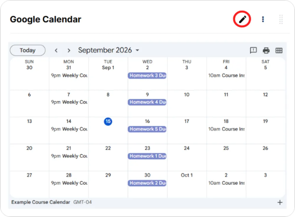
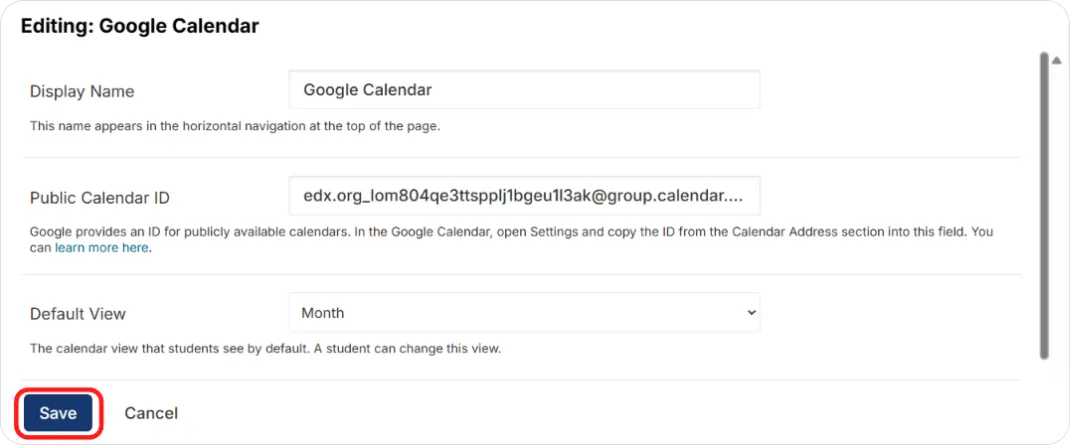
Note: Google’s interface changes from time to time, so the exact path to the sharing settings and calendar ID may differ from the steps above. The two things you need are a publicly shared calendar and its ID.
Note: Google services aren’t reachable in some countries. Learners in those regions may see nothing where the calendar should be. Provide the same information another way if this affects your audience.
Google Document
Section titled “Google Document”What it’s for. Embeds a Google Doc, Sheet, Slides deck, Drawing, or Form so learners read it in place. Most often used for slide decks, which is why it appears as Embed Google Slides in the suggested modules list.
Setting it up.
First, publish the file and copy its embed code:
-
Open the file in Google Drive.
-
From the File menu, choose Publish to the web.
-
Select Publish and confirm.
-
Open the Embed tab.
-
Copy the entire string from the Embed field, including the <iframe> tags. For an image, copy the full img tag instead, since Google images don’t use an iframe.
Then add the component:
-
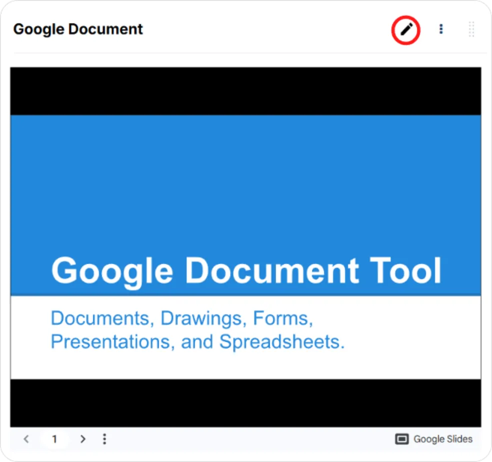
Add Google Document from the Advanced list. It arrives with a default presentation embedded.
-
Click the pencil icon.
-
Enter a Display Name.
-
Paste the string into Embed Code.
-
Click Save.
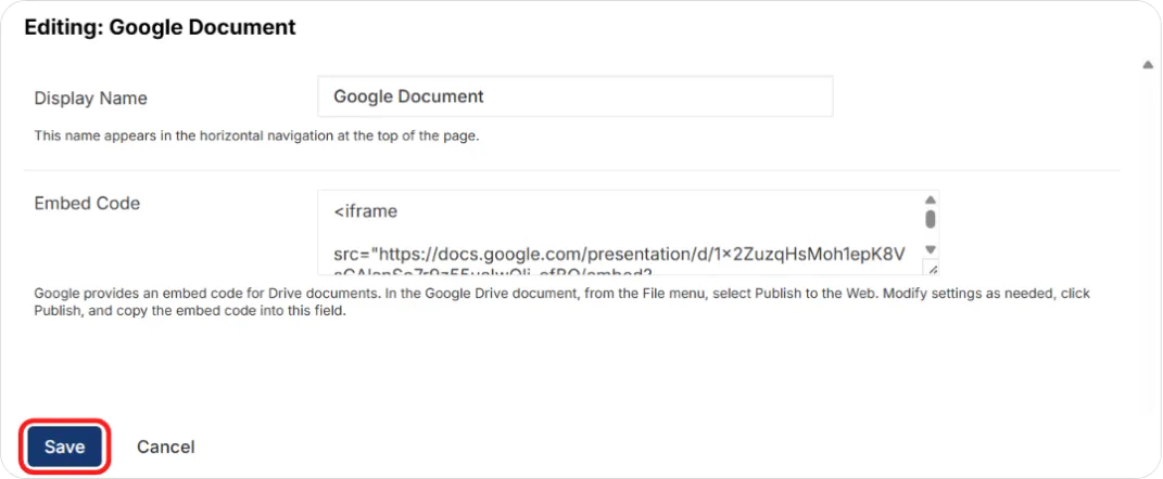
Tip: It’s the embed code you need, not the document’s share link. A share link pasted here will not render.
Note: Once embedded, edits you make to the file in Google appear to learners immediately. You never need to touch the component again to update the content.
Note: Blend-ed sets the height and width of embedded Google files. Size attributes in your embed code are overridden.
H5P Content
Section titled “H5P Content”What it’s for. Plays H5P interactive content: interactive video, branching scenarios, drag-and-drop, flashcards, memory games, timelines, and many more. Several H5P types report a score to the gradebook, so it works for graded practice as well as exploration.
Setting it up.
-
Build your activity in H5P and export it as an .h5p file, or get the URL of hosted H5P content.
-
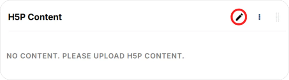
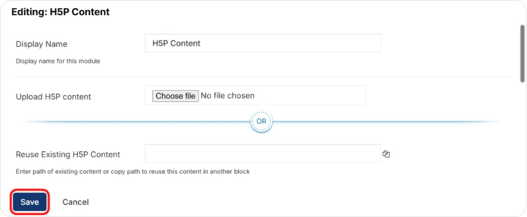
Add the component and click the pencil icon.
-
Upload the .h5p package, or enter the hosted content URL.
-
Set display options: whether to show the H5P frame, download button, copyright information, and embed button.
-
If the activity is scored, set whether it’s graded and its weight.
-
Click Save, then preview with View Live Version.
Tip: Test the activity as a learner before publishing. H5P content is self-contained, so a package that fails to load gives learners a blank space rather than an error they can report usefully.
Interactive Content XBlock
Section titled “Interactive Content XBlock”What it’s for. Custom activities built from HTML, CSS, and JavaScript, with learner interactions captured for grading, analytics, and state restoration.
This is the component to use when you’ve generated an interactive activity with an AI tool. Pasting raw HTML into a Text component gives you something that looks right but records nothing: no interaction data, no grade, no memory of what the learner did. This component captures all of it.
Setting it up.
-
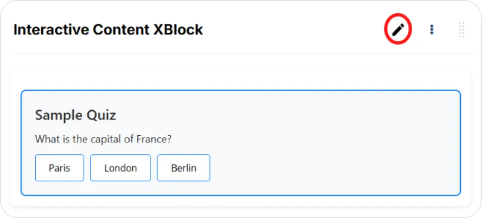
Add the component and click the pencil icon.
-
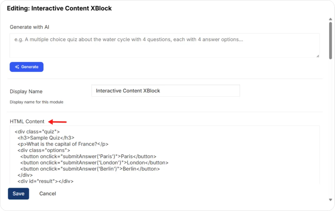
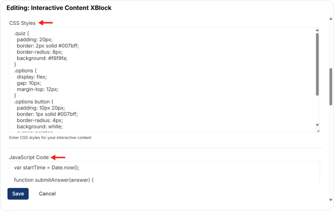
Fill in the fields below.
-
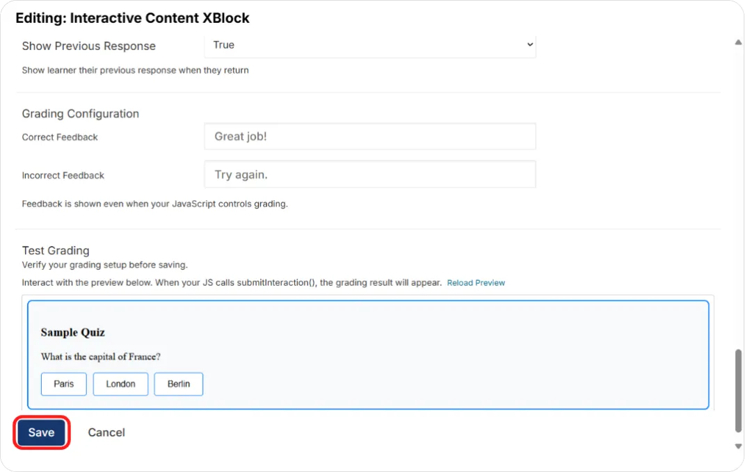
Use Test Grading to confirm your grading works.
-
Click Save, then publish.
| Field | What it does |
|---|---|
| Generate with AI | Generates the HTML, CSS, and JavaScript from a prompt. Click Generate |
| Display Name | Name shown for this component |
| HTML Content | The markup rendered inside the block |
| CSS Styles | Styles for your content |
| JavaScript Code | Interactivity. Call submitInteraction(data) to send data back to the component |
| Weight | How much this activity counts toward the grade |
| Completion Mode | On submit when the learner submits, On view for simulations with nothing to submit, or Manual when your JavaScript calls markComplete() |
| Auto Grade Enabled | Grades automatically from the interaction data |
| Show Feedback to Learners | Shows correct and incorrect feedback |
| Show Previous Response | Restores the learner’s last submission when they return |
| Grading Configuration | Your Correct Feedback and Incorrect Feedback messages. These display even when your own JavaScript controls grading |
| Enable Debug Mode | Staff-only state panel, for development |
Test Grading
Below the fields sits a live preview. Interact with it, and when your JavaScript calls submitInteraction() the grading result appears. Reload Preview refreshes it after you change your code.
Tip: Run Test Grading before every save. Custom JavaScript grading is easy to get subtly wrong, and this is where you want to discover that, not in a learner’s gradebook.
Generating content without writing code
Two routes: the built-in Generate with AI field, or Blend-ed’s Interactive XBlock Content Generator on the Blend-ed website. The generator takes your own Gemini API key and produces simulations, roleplays, or interactive quizzes for you to review and export. It runs entirely in your browser, so your API key never leaves your device.
LTI Consumer (Creating & Managing Live Sessions)
Section titled “LTI Consumer (Creating & Managing Live Sessions)”What it’s for. The LTI Consumer component lets you bring third-party tools, external applications and external learning content directly into your Blend-ed course. Learners use the tool inside the course without leaving Blend-ed.
LTI (Learning Tools Interoperability) is a standard way for learning platforms and external tools to work together. In this setup, Blend-ed is the LTI Consumer (the host platform), and the external tool is the LTI Provider.
What it can do
| Capability | What it means |
|---|---|
| Tool integration | Add any LTI-compliant tool to your course outline, such as Zoom for live sessions, adaptive learning tools, quizzes or lab simulations |
| LTI versions | Supports LTI 1.1/1.2 (basic launch and grade passback), and LTI 1.3 with LTI Advantage |
| Display options | Show the tool inline in the page, in a pop-up (modal) window, or in a new browser tab |
With LTI 1.3, the component also supports these LTI Advantage services:
| Service | What it does |
|---|---|
| Deep Linking | Lets you choose and set up specific content from the tool without entering parameters by hand |
| Assignment and Grade Services (AGS) | Sends scores and activity status from the tool back to the Blend-ed gradebook |
| Names and Role Provisioning Services (NRPS) | Shares roster details, such as names, emails and roles, between Blend-ed and the tool |
Note: Check which LTI version your tool supports before you start. The tool’s vendor will give you the credentials and launch URL you need.
Note: Only send learners’ details, such as username and email, when the tool genuinely needs them. Each field you share is learner data leaving your platform.
Example: Adding Zoom live sessions with LTI Consumer
Zoom is one of the tools you can add with LTI Consumer. Using Zoom’s LTI Pro app, you can put a Zoom meeting panel inside a unit. Instructors schedule meetings from inside the course, and learners see the upcoming sessions and join with one click. This is useful for scheduled classes, office hours and cohort calls.
Before you start. You need:
-
a Zoom account with admin access, to set up Zoom LTI Pro
-
LTI Consumer enabled for the course. If it isn’t listed under Add component > Advanced, enable lti_consumer in the Advanced Module List first. See Part 1 of this article.
Setting up Zoom has three stages: getting credentials from Zoom (once), adding them to your course, then adding the session to a unit.
Stage 1: Get your Zoom LTI Pro credentials (one-time)
If you haven’t set up LTI Pro before:
-
Go to the Zoom Marketplace and search for LTI Pro.
-
Add the app, and click Authorize when it asks for access to your Zoom account.
-
Create a new credential, give it a name, and click Save.
If you already use LTI Pro:
-
Sign in to the Zoom Marketplace and click Manage.
-
Click Added Apps.
-
Beside LTI Pro, click ···, then Configure.
-
Create a new credential, give it a name, and click Save.
Then, on the LTI Credentials tab:
-
In Email or Employee Unique ID Attribute Name, enter instructor_email.
-
In Approved Domains, add your learner and Studio addresses, for example https://apps.learn.blend-ed.com/ and https://author.learn.blend-ed.com/.
-
Copy the LTI Key and LTI Secret. You’ll need both in Stage 2.
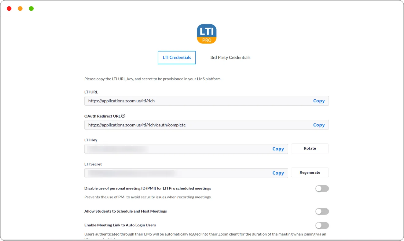
Note: Treat the LTI Key and Secret like a password. Anyone who has them can connect a tool to your Zoom account. If they’re ever exposed, click Regenerate in Zoom and update the passport in Blend-ed.
Stage 2: Add the credentials to your course
-
Open the course, then under OTHER SETTINGS click Advanced Settings.
-
Scroll to Course Customization > LTI passports.
-
Fill in the three boxes:
| Box | What to enter |
|---|---|
| ID | zoom, or another short label. You’ll enter this again in the component |
| client_key | The LTI Key from Zoom |
| client_secret | The LTI Secret from Zoom |
- Click Save Changes. A confirmation reads Your changes have been saved.
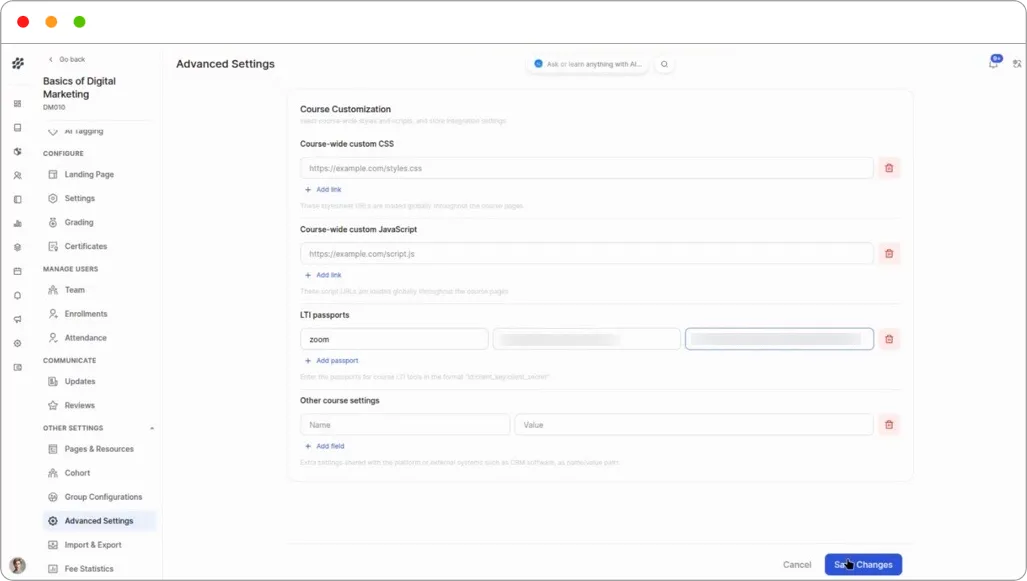
Tip: Click + Add passport if you need credentials for more than one LTI tool. Each passport needs its own ID.
Stage 3: Add the live session to a unit
- In the unit, click Add component > Advanced > LTI Consumer.
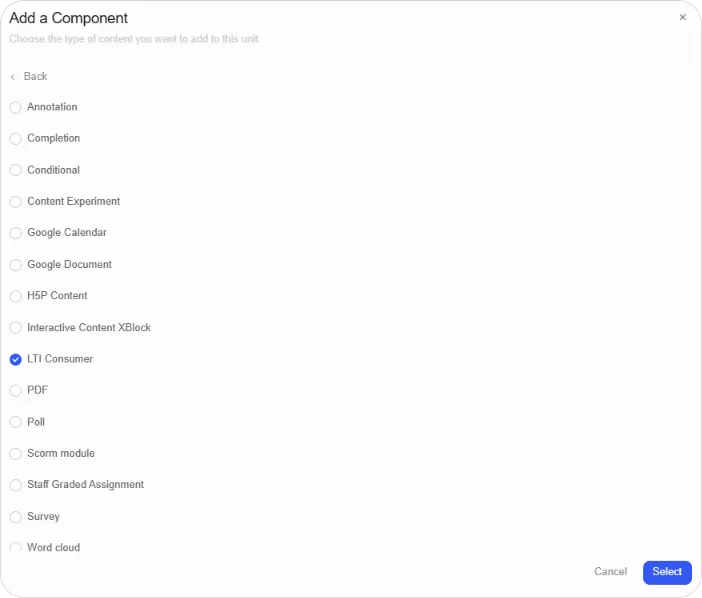
The component shows Please provide launch_url. Click “Edit”, and fill in the required fields.
- Click the pencil icon to open the editor.
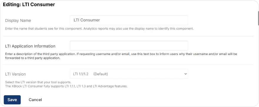
- Fill in these settings:
| Setting | What to enter |
|---|---|
| Display Name | A name learners will see, for example Live Session |
| LTI Application Information | A short description of the tool, for example Zoom |
| LTI Version | LTI 1.1/1.2 |
| LTI ID | The ID from your passport, for example zoom |
| LTI URL | https://applications.zoom.us/lti/rich |
| Custom Parameters | [“instructor_email=your Zoom admin email”], for example [“[email protected]”] |
| Scored | False. Live sessions don’t send a grade |
-
Optionally, set LTI Launch Target to Modal and adjust Modal Height and Modal Width if you want the Zoom panel to open in a pop-up instead of inline.
-
Click Save.
The Zoom panel now appears in the unit.
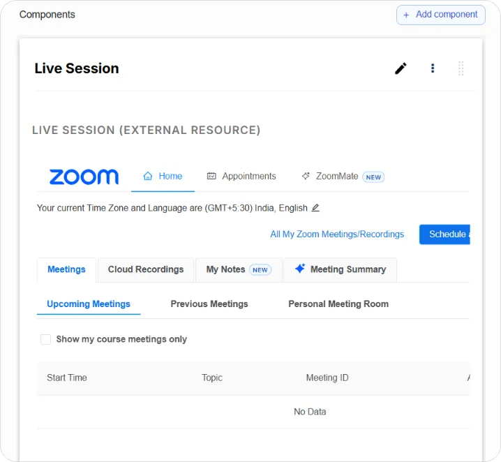
-
In the Zoom panel, click Schedule a New Meeting and set up your session. It appears under Upcoming Meetings.
-
Click Publish Unit.
Tip: Tick Show my course meetings only in the Zoom panel to hide meetings from other courses on the same Zoom account.
Note: The LTI ID must match the passport ID exactly, and the instructor_email must be the email of the Zoom account that set up LTI Pro. A mismatch in either is the most common reason the panel doesn’t load.
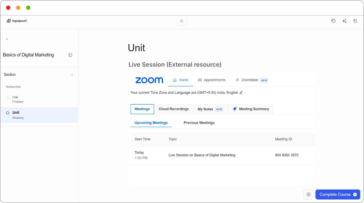
What learners see
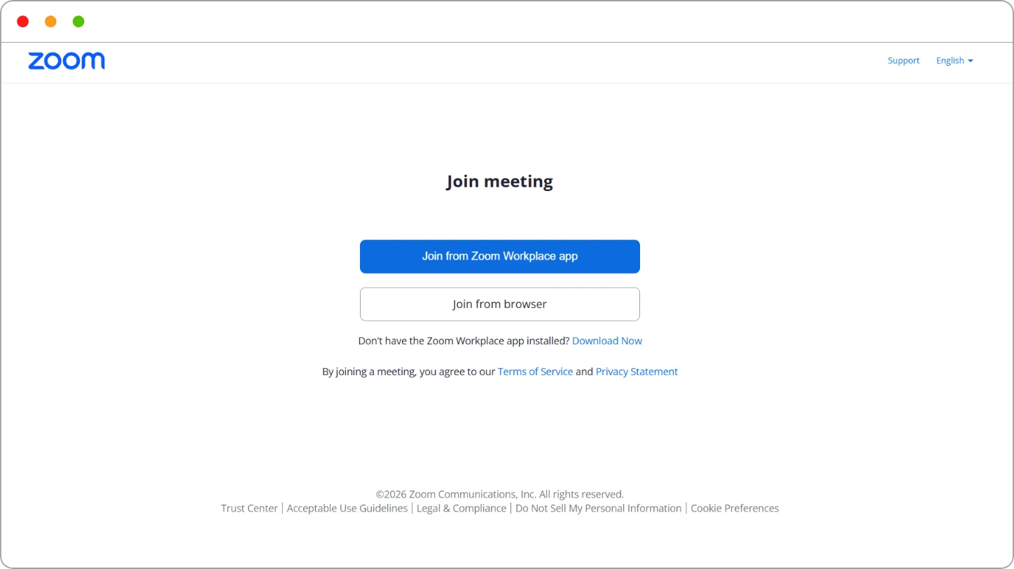
Learners open the unit and see the session’s upcoming meetings, each with its topic and meeting ID. They click Join, then choose Join from Zoom Workplace app or Join from browser.
Tip: Preview the unit with View Live Version before publishing, and join a test meeting yourself.
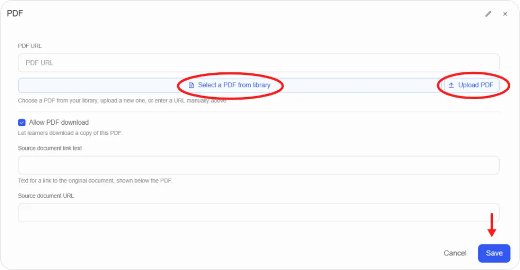
What it’s for. Displays a PDF inline with a viewer, so learners read it without downloading anything. Good for handouts, reference sheets, standards, and worksheets. For long multi-chapter documents, use Textbooks instead.
Setting it up.
-
Upload your PDF under BUILD > Assets and copy its URL, or have an external URL ready.
-
Add the component and click the pencil icon.
-
Enter a Display Name.
-
Paste the URL into the PDF URL field.
-
Choose whether to allow downloading.
-
Click Save.
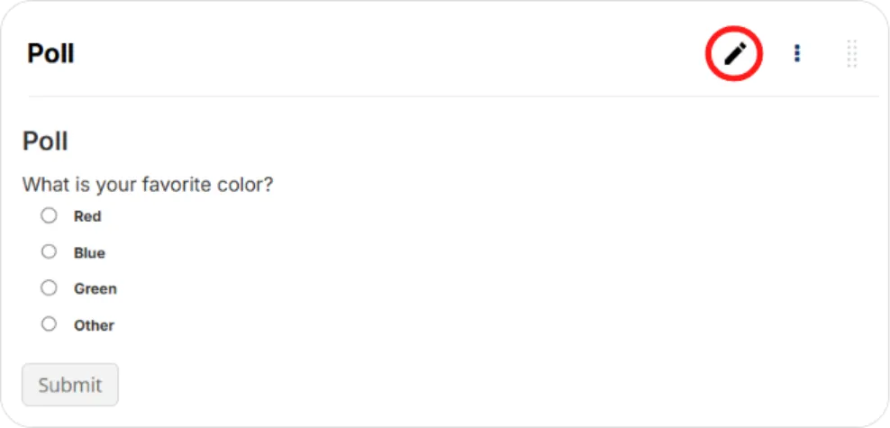
What it’s for. One question with a set of answer options, showing learners the aggregate results once they’ve answered. Ungraded. Good for opening a topic with a temperature check, gathering opinion, or creating a moment of engagement before a lesson.
Setting it up.
-
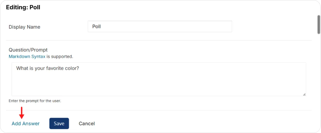
Add the component and click the pencil icon.
-
Enter a Display Name.
-
Enter your question.
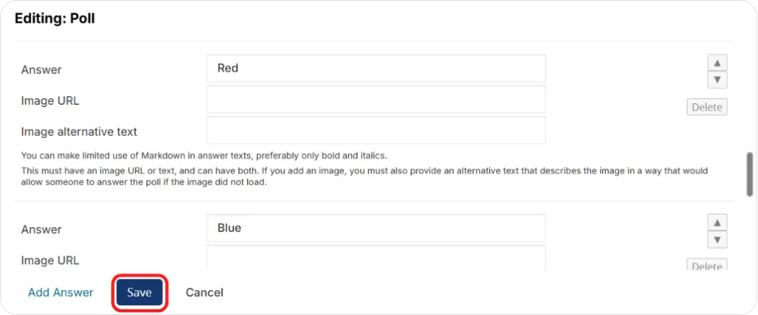
-
Enter each answer option. Options can include an image as well as text.
-
Optionally add feedback text shown after answering.
-
Set whether results are private, and the maximum number of submissions allowed.
-
Click Save.
SCORM module
Section titled “SCORM module”What it’s for. Plays a SCORM package, saving learner state and reporting scores to the course Progress tab. Supports SCORM 1.2 and SCORM 2004. Good for existing e-learning built in Articulate Storyline, Adobe Captivate, iSpring, or similar, including compliance content you’re required to deliver unchanged.
Setting it up.
-
Export your content from your authoring tool as a SCORM .zip package.
-
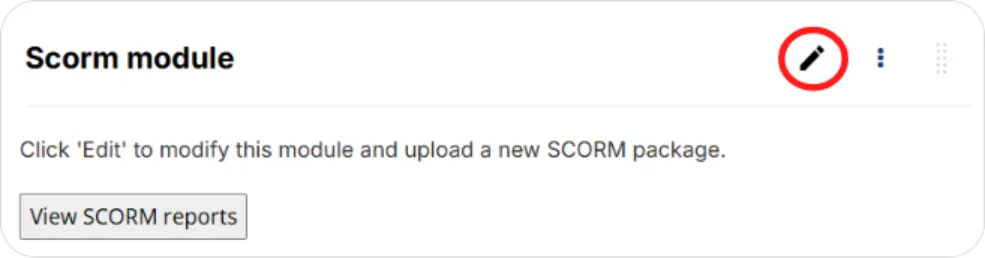
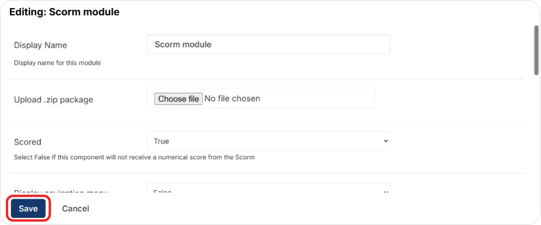
Add the component and click the pencil icon.
-
Upload the .zip package.
-
Set Scored to False if the package has no quizzes. If Scored is True, set the Weight to the points the quiz is out of.
-
Enter a Display Name.
-
Click Save, publish, and test with View Live Version.
Things to know
-
One SCORM component per unit. More than one won’t work.
-
Display Name is Studio-only. Learners see the component under the unit title, not the display name.
-
Keep packages between roughly 1 MB and 15 MB. Larger packages load slowly and make for a poor learner experience. Break long content into unit-sized chunks, ideally with one quiz per package.
-
SCORM content isn’t supported in the mobile app. If your learners are mobile-first, plan around this.
Tip: Confirm the score and completion actually reach the gradebook before releasing the course. A package that plays perfectly can still fail to report.
Staff Graded Assignment
Section titled “Staff Graded Assignment”What it’s for. Assigning scores for work done off the platform: attendance, participation, practical assessments, in-person presentations. The component shows learners your instructions and displays the grade you give them.
How grading works. There’s no learner submission. Learners don’t upload anything. You enter grades in bulk by exporting a CSV, filling it in, and importing it back.
Setting it up.
-
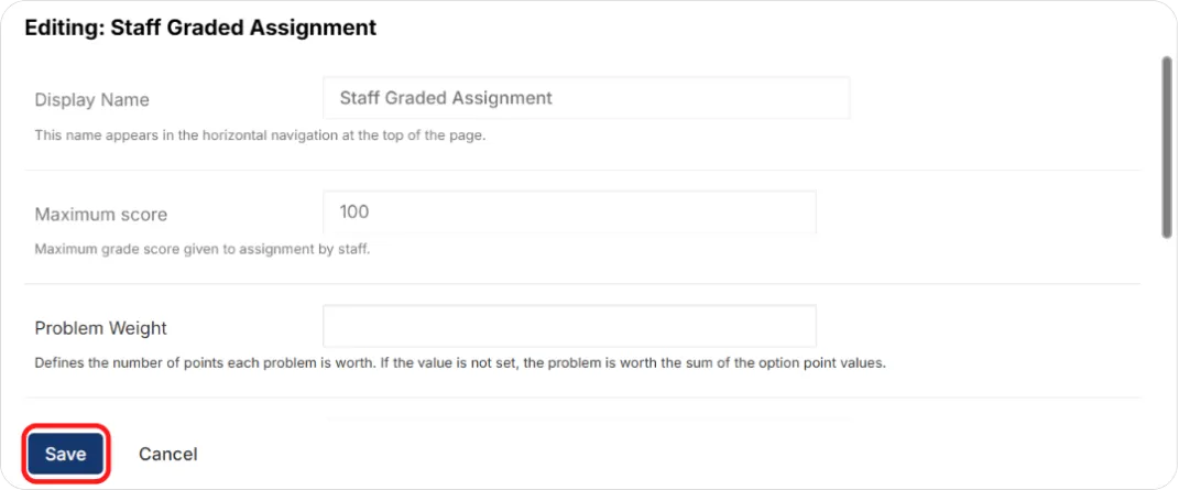
Add the component and click the pencil icon.
-
Enter a Display Name and the Maximum Score (or Problem Weight, the points possible, which defaults to 1.0).
-
Add instructions telling learners what the off-platform activity is and how it will be assessed.
-
Click Save and publish.
Grading learners
Once the course is running and learners have completed the activity:
-
Open the component’s instructor view in the live course.
-
Export scores. Download the grading CSV. You can filter by track or cohort to grade a subset of learners.
-
Fill in the grades. Open the CSV in a spreadsheet and enter scores in the New Points column. Leave any row blank to leave that learner’s score unchanged.
-
Import scores. Upload the completed CSV. Learners see their grades as soon as the import finishes.
-
Review the result. A summary appears at the bottom of the screen showing what was validated and applied.

Note: The import handles files up to about 4 MB. For very large cohorts, split the CSV into several files, keeping the header row in each, or use the track and cohort filters to grade in batches.
Note: If you need learners to submit a file or a written answer, this isn’t the right component. Use the Open Response core component instead, covered in Adding Content Components.
Survey
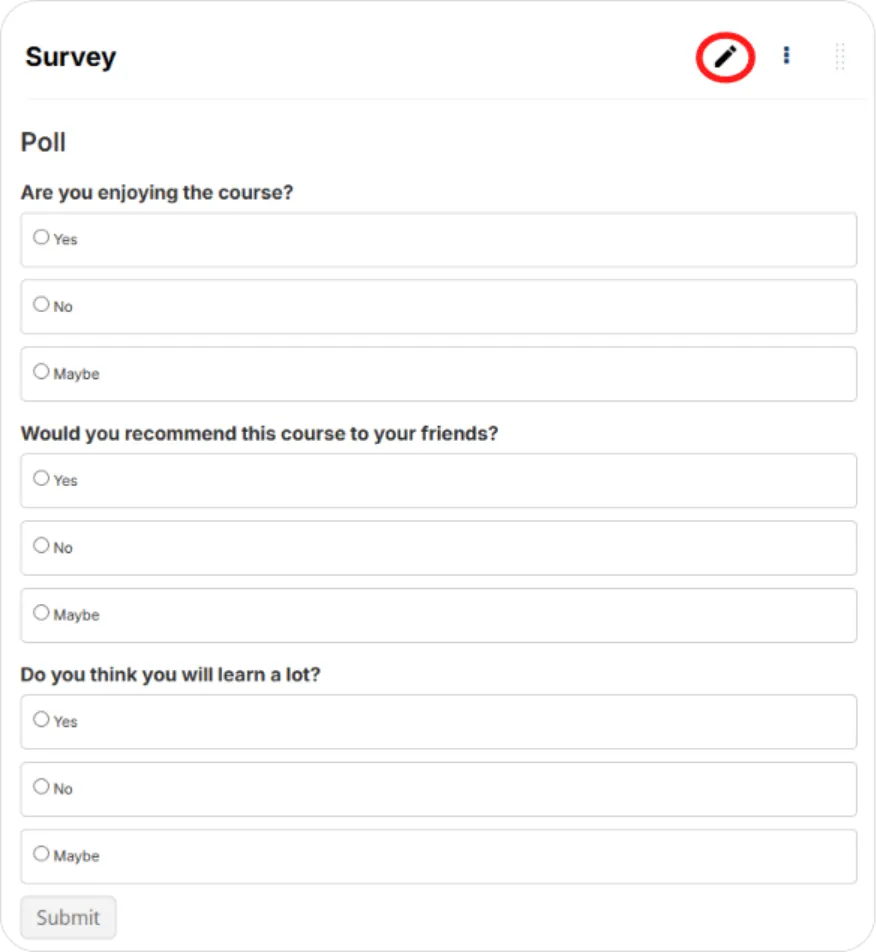
Section titled “Survey”What it’s for. Several questions that share one set of answer options, laid out as a grid, with aggregate results shown afterwards. Ungraded. Good for course feedback, self-assessment checklists, and pre-course skill audits.
Setting it up.
-
Add the component and click the pencil icon.
-
Enter a Display Name.
-
Enter the answer options. These are shared across every question, which is what makes the grid layout work.
-
Enter your questions.
-
Optionally add feedback text shown after submission.
-
Set whether results are private, and the maximum number of submissions.
-
Click Save.
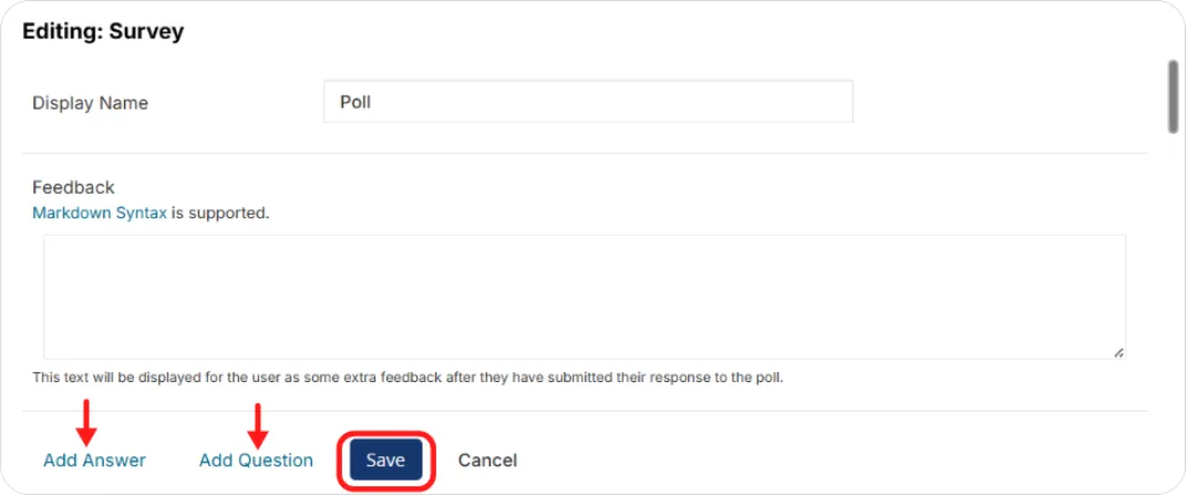
Tip: Because all questions share the same options, a survey only works when every question fits the same scale. Mixed question types need separate Poll components or a Problem component instead.
Word cloud
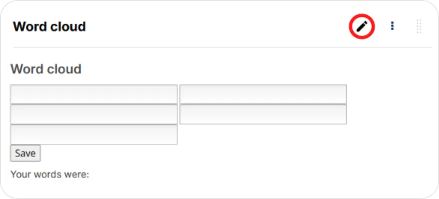
Section titled “Word cloud”What it’s for. Learners submit words in response to a prompt, and the component displays everyone’s answers as a cloud that grows as more people respond. Good for brainstorming, surfacing prior knowledge, and giving a cohort a visible sense of shared thinking.
Before you start. Word cloud isn’t in the suggested modules list. Type word_cloud into the Add module field in Advanced Settings and save.
Setting it up.
-
Add the component and click the pencil icon.
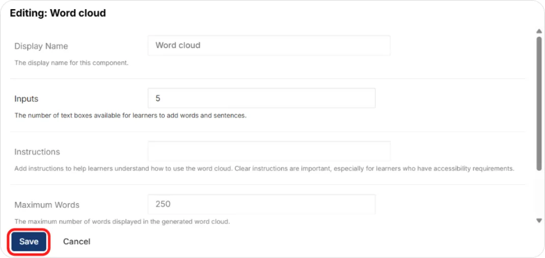
-
Enter a Display Name and your instructions or prompt.
-
Set the number of inputs — how many words each learner submits.
-
Set the maximum number of words shown in the cloud.
-
Choose whether to display the percentage alongside each word.
-
Click Save.
Textbooks
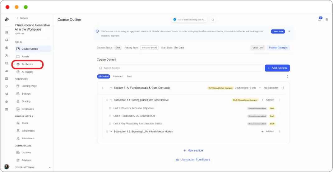
Section titled “Textbooks”Textbooks are managed in their own area rather than added as a component. A textbook appears as a dedicated tab in the course with chapters learners can navigate.
What it’s for. Long reference documents split into chapters: course handbooks, manuals, standards. Learners get a navigable table of contents instead of one endless PDF.
Setting it up.
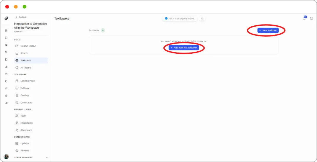
- In the course-level left navigation under BUILD, click Textbooks.
- Click + New textbook.
-
Enter a Textbook name, for example Course Handbook.
-
Under Chapters, enter a Chapter name and add the PDF file, either by uploading it or pasting a Studio path.
-
Click + Add a chapter for each additional chapter.
-
Click Add Textbook.
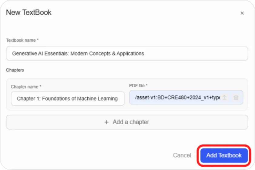
Both Textbook name and each Chapter name and PDF are required, so the Add Textbook button stays disabled until every chapter row is complete.
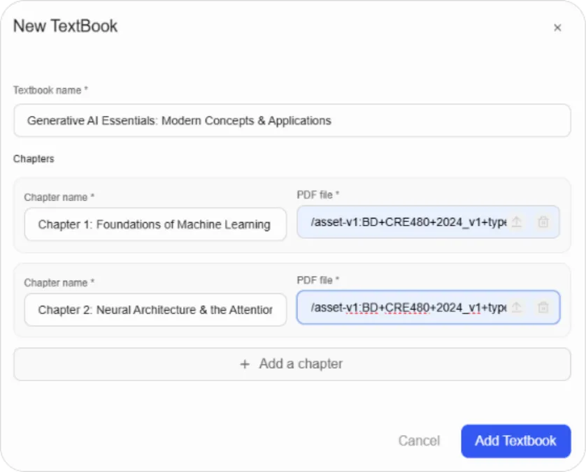
Tip: One PDF per chapter. A ten-chapter textbook is far more usable than a single 200-page file, and learners can jump straight to what they need.
Publishing
Section titled “Publishing”Advanced components follow the same draft rules as core components. Use Publish Unit in the Unit sidebar, or Publish Changes on the Course Outline page.
Because advanced components often depend on external services, preview them with View Live before publishing to check they load correctly for learners.
What’s next
Section titled “What’s next”-
Core content types: Adding Content Components
-
Upload the files these components point to: Managing Assets
-
Custom CSS, LTI passports, and group configurations: Advanced Course Configuration